How to Design Mobile Apps in 2026: 7 Steps, iOS and Android
Here's how to design mobile apps in 2026: start with the one job your app does, map the few screens that job needs, and sketch them for one thumb. Then design each screen with its platform's own system (Liquid Glass on iPhone, Material 3 Expressive on Android), make it adapt to any window size, and test it on real phones.
If you're planning an app or a redesign, that order matters more than it used to, because Apple and Google both changed their design rules in 2025.
Key takeaways
In this guide
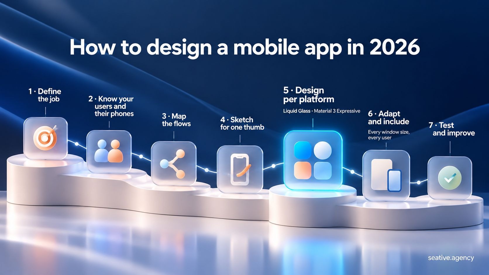
You design a mobile app in seven steps, from the app's job to tests on real phones. Visual style only shows up at step 5, because most design problems get solved before anyone picks a color. It closely follows the seven-step process we use at Seative Digital:
Before drawing a single screen, decide the one job your app does, who'll use it on which phones, and the few flows that job needs. Write each one down, since every later design choice traces back to them.
Think about packing for a work trip: you check where you're going before choosing a single shirt. Your app's job picks the features for version one in the same way, though unlike a suitcase, an app can grow after launch.
So for step 1, write a job statement such as "help freelancers send an invoice in under a minute." For step 2, talk to a handful of likely users and check which phones they carry. A lot of teams skip that check, and then they design iPhone-first for people who mostly use Android.
Stick with me here, because that mismatch is easy to miss. In September 2026, StatCounter's mobile OS data gave iOS about 54% of US mobile web traffic, while Android had about 93% in Bangladesh.
Step 3 turns the job into flows: list the three to five tasks people come for and the screens each one needs, then make those tasks your main navigation.
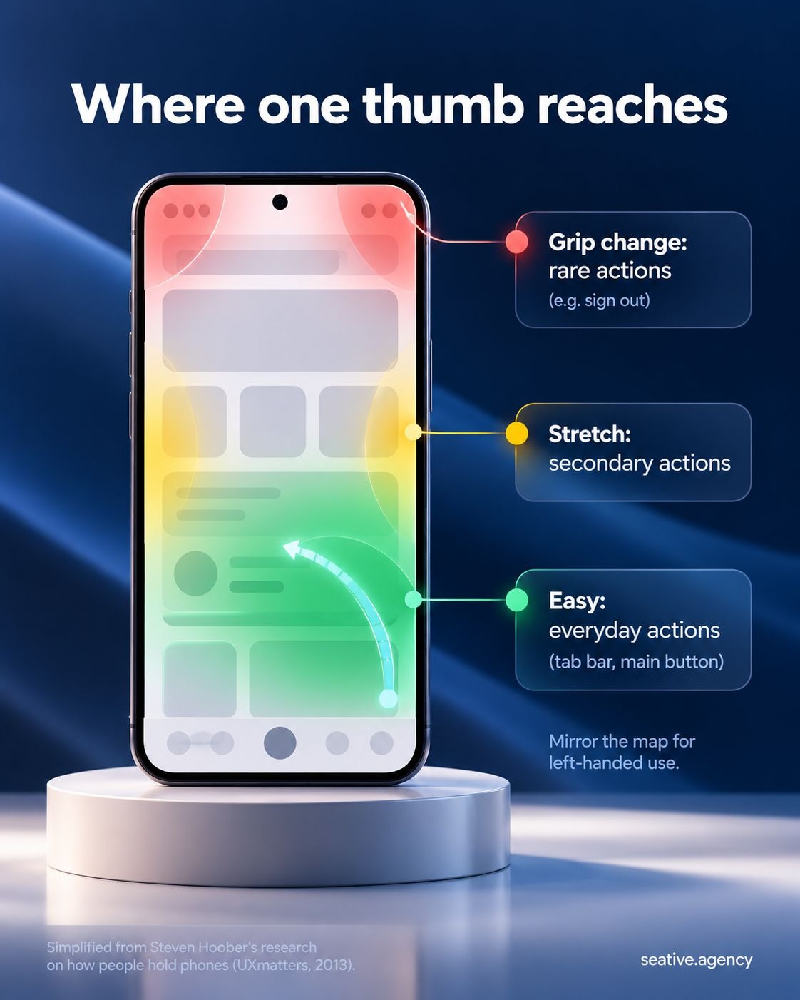
Once your flows are mapped, sketch your main screens as grayscale wireframes (plain box-and-line layouts), with the most-used actions in the lower and middle part of the screen, where a thumb reaches easily. Leaving color out keeps feedback on layout and flow instead of taste.
You know how it feels to check your phone while holding a shopping bag: one thumb does all the work, and the top corners are a stretch. In Steven Hoober's 2013 street study, 49% of the people he saw touching their phones used one hand.
Hoober also saw people change grips every few seconds, so treat the top as harder to reach rather than off-limits. It's a fine home for rare actions like sign out.
Both platforms now lean this way, with search at the bottom of the iPhone screen since iOS 26 and floating toolbars in Material 3 Expressive.
Once your wireframes hold up, design each platform with its own system: Liquid Glass on iPhone and Material 3 Expressive on Android. Start from the standard components and official UI kits. They pick up each new look, and many accessibility settings, for you.
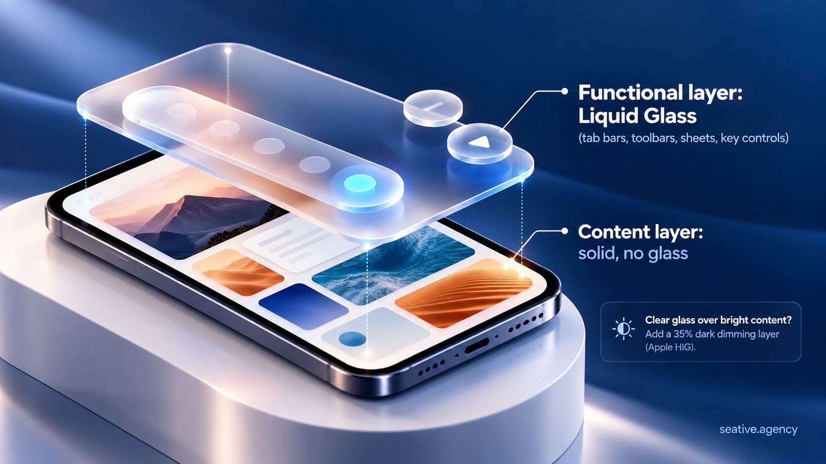
Liquid Glass is Apple's translucent material for controls and navigation, introduced with iOS 26 in September 2025. Apple's Human Interface Guidelines describe it as a layer floating above your content and say not to use it in the content layer itself.
So use standard tab bars, toolbars and sheets, which adopt the material automatically, and remove custom backgrounds that fight the glass. Keep glass effects for your most important controls rather than every card.
Legibility is the tricky part. Think about reading a menu taped to a café window: easy against a plain wall, hard with a busy street behind it. Glass controls over photos have the same problem, so Apple suggests a 35% dark dimming layer under clear glass on bright content.
Nielsen Norman Group's review of iOS 26 argued that the glass made the interface less legible. And since iOS 27 arrived on September 14, 2026, people can slide the effect from fully clear to fully opaque, so test your screens at both ends.
Opting out won't work for long, though, because Apple's compatibility key for keeping the old look is ignored once you build for iOS 27.
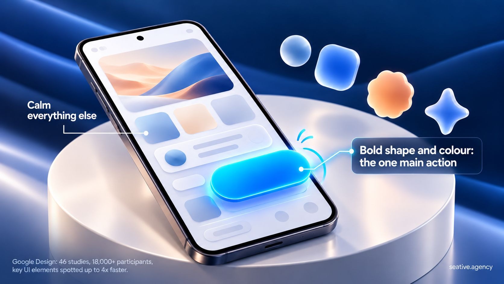
Material 3 Expressive is Google's update to Material Design, and it reached Pixel phones with Android 16 in September 2025. It uses bolder shapes, color, type and springy motion to make the most important actions easier to find.
In Google's expressive design research, 46 studies with over 18,000 participants found that people spotted key UI elements up to four times faster in expressive designs. The update also brought 35 new shapes and components like button groups, split buttons and floating toolbars.
Think about a highlighter on a printed page: one highlighted line jumps out, but highlight every line and nothing does. So save your boldest shape and color for the one action that matters most on each screen. Google's researchers also warn that "no amount of expressive design will beat basic functionality.
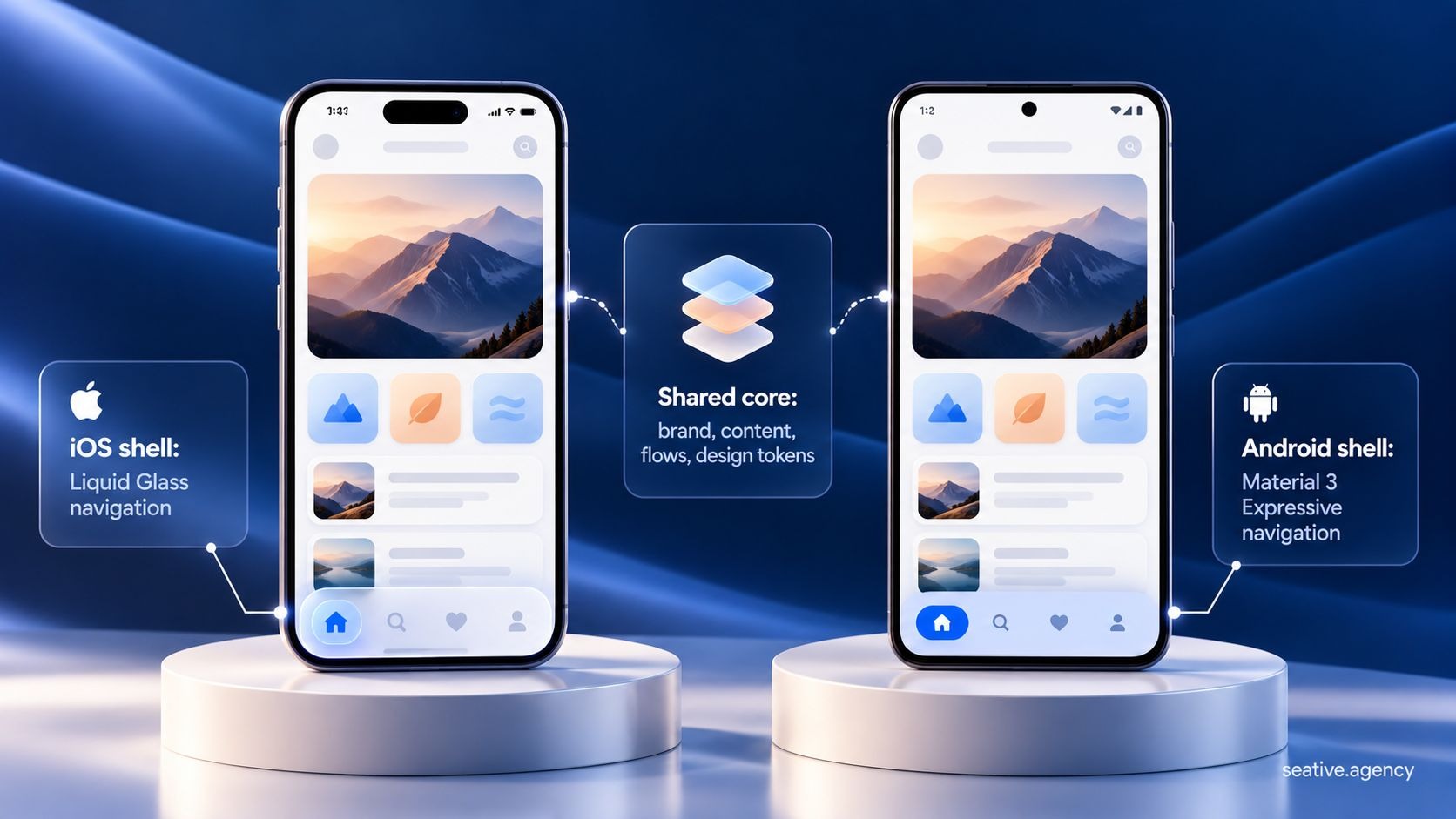
Your two apps should feel like one product without looking identical. Think of it as "shared core, native shell." Keep brand, content, flows and design tokens (saved colors, spacing and type sizes) the same, and let navigation, controls and motion follow each platform.
You might be thinking one design for both would save money. It does at first, but people notice when an app ignores their phone's habits, like where the back button sits.
Make every layout respond to the window your app gets rather than the device, and meet the published targets for touch size, text size and contrast. Your platform-ready screens aren't finished until they pass both.
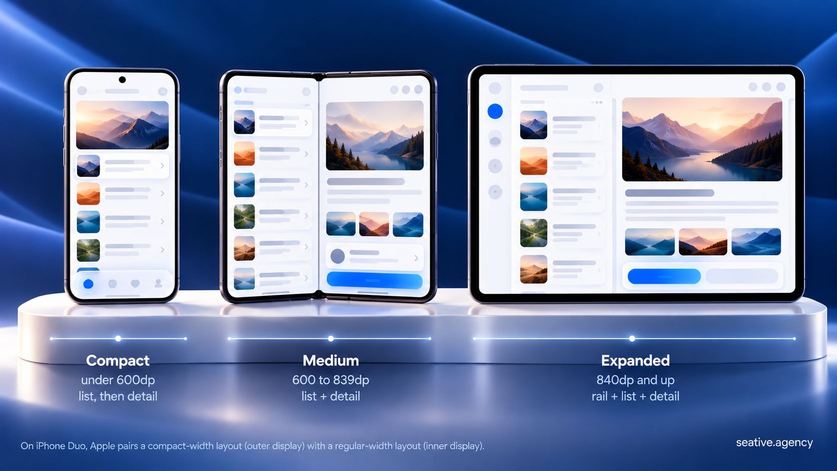
Adaptive UI means one app that rearranges itself as its window changes. Think about a folding dining table: folded, it fits two plates, and opened up, the same dishes spread out so everyone can reach them. Your list and detail screens do the same, stacking on a phone and sitting side by side on a bigger screen. Unlike a table, though, a window can change size halfway through a task.
Fair question: does a small app really need this? In 2026, both platforms answered for you. Apple announced its first foldable, iPhone Duo, in September 2026. Its design guidelines for iPhone Duo say to build every app to resize, using a compact-width layout for the outer display and a regular-width one for the inner.
Android got there first. Apps targeting Android 16 have their orientation and resizing locks ignored on screens 600dp (density-independent pixels) and wider. Google Play has required that target for updates since August 31, 2026, and apps targeting Android 17 lose the opt-out. Google's Android Developers Blog also counts over 580 million large-screen Android devices, whose users typically spend roughly 5x more than phone-only users.
So sketch at least three widths: compact (under 600dp), medium (600 to 839dp) and expanded (840dp and up).
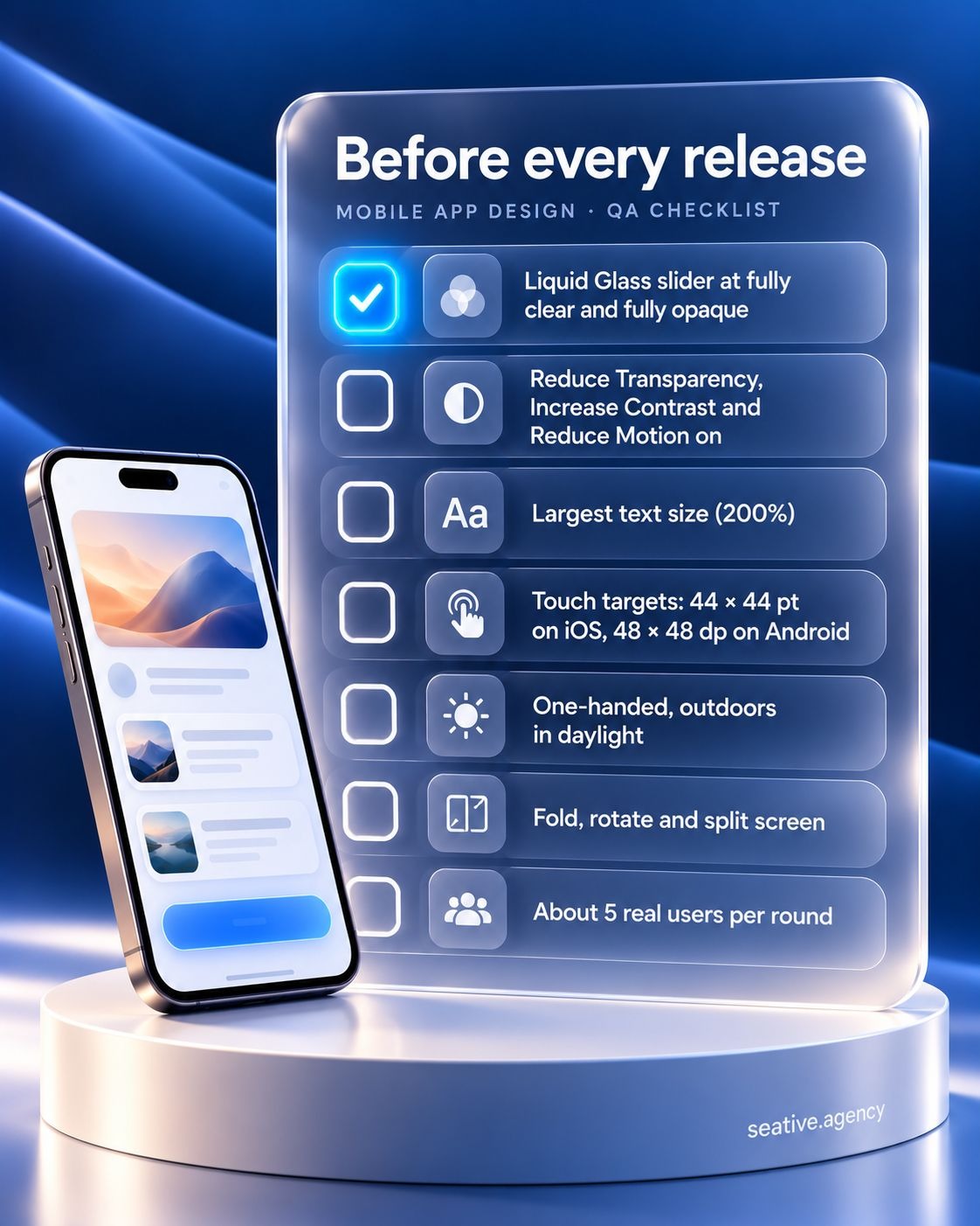
Check these numbers on every screen:
Then turn on Reduce Transparency, Increase Contrast and Reduce Motion, and check that nothing breaks. If you sell in the EU, the European Accessibility Act has covered apps for services like online shopping and banking since June 28, 2025. A legal adviser can tell you what applies to your app.
Once the numbers check out, turn your screens into a clickable prototype, test it with about five users per round on real phones, fix what trips them up, and keep measuring after launch. Jakob Nielsen's advice still holds: several small rounds of testing beat one big one.
I know testing sounds dull, but it's the cheapest place to catch a mistake. Think about trying on shoes: they can look perfect in the box, yet you only learn they pinch after a few steps around the shop. A prototype on a real phone is that walk, so test outdoors, one-handed, at the largest text size and with the Liquid Glass slider at both ends.
Then fold it, rotate it and open it in split screen. After launch, check store reviews and analytics monthly, and revisit the design each summer, once Google I/O and Apple's WWDC have set the next year's changes.
And if you'd rather have someone run these seven steps with you, that's what our mobile app design team does.
Yes, for a first version, as long as you stick to each platform's standard components and test with real people before anyone writes code. Bring in an experienced designer before launch if your app handles payments, health data or a large audience.
Most teams use Figma for wireframes, screens and prototypes. Add Apple's design resources, including iOS 27 UI kits and Icon Composer for layered Liquid Glass app icons, plus Google's Material 3 Design Kit. AI tools like Figma Make and Google Stitch speed up first drafts, but they don't replace testing.
Start with the platform most of your users carry. StatCounter's September 2026 figures put iOS slightly ahead in the US, while Android dominated in Bangladesh. If your audience is split, design both at once, keeping a shared core and letting navigation follow each platform.
Only for a while. Apple's UIDesignRequiresCompatibility key keeps the pre-iOS 26 look, but Apple's documentation says the system ignores it once you build for iOS 27 or later. Apple hasn't said when Xcode 27, its app-building tool, becomes mandatory for uploads, so plan your update now.
AI can draft screens fast, but it can't decide your app's job, users or flows. In Figma's 2026 AI report, 90% of respondents said design is at least as important as it was before AI. At Seative Digital, we use AI to speed up research and exploration, and our designers refine every output.
So how to design mobile apps in 2026 comes down to this: settle the job, the people and the flows, then let each platform's system carry its share. Those systems will keep changing, but a clear job and tested flows survive every update. This week, write your app's job in one sentence and check which phones your users carry.
If you'd like someone to look over your plan, book a 30-minute strategy call and we'll walk through your flows together.