How to design an ecommerce website in 2026: a conversion-first architecture

To design an ecommerce website that sells: plan it in the order your shoppers decide. Help them find the right product, give every product page enough proof to buy, and keep checkout short. Underneath all three, you need fast, accessible pages and complete product data, because in 2026 AI shopping assistants read your store too.
If you're planning a new store or a redesign, this order saves you from polishing pages your shoppers never reach.
Key takeaways
In this guide
A conversion-first ecommerce website is a store whose architecture, meaning how its pages are planned and linked, follows the decisions shoppers make before buying. Conversion rate is the share of visitors who buy, so you design for that number first and pick colors later.
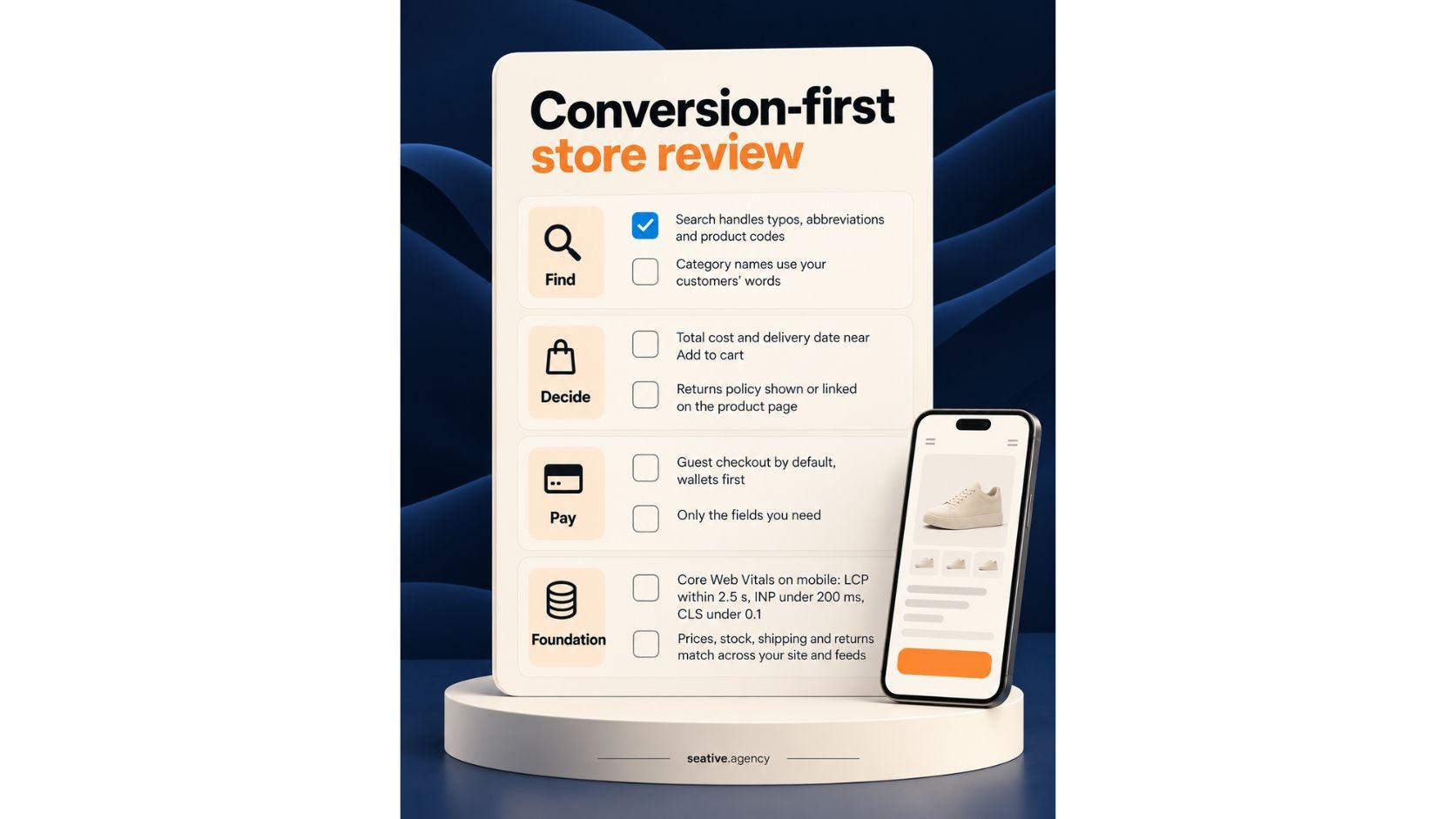
I group those decisions into three layers on one foundation, and you've probably moved through all of them as a shopper:
At Seative Digital, this map comes out of the UX strategy step, before anyone opens a design file. Skip it, and you get a beautiful home page with an untested checkout.
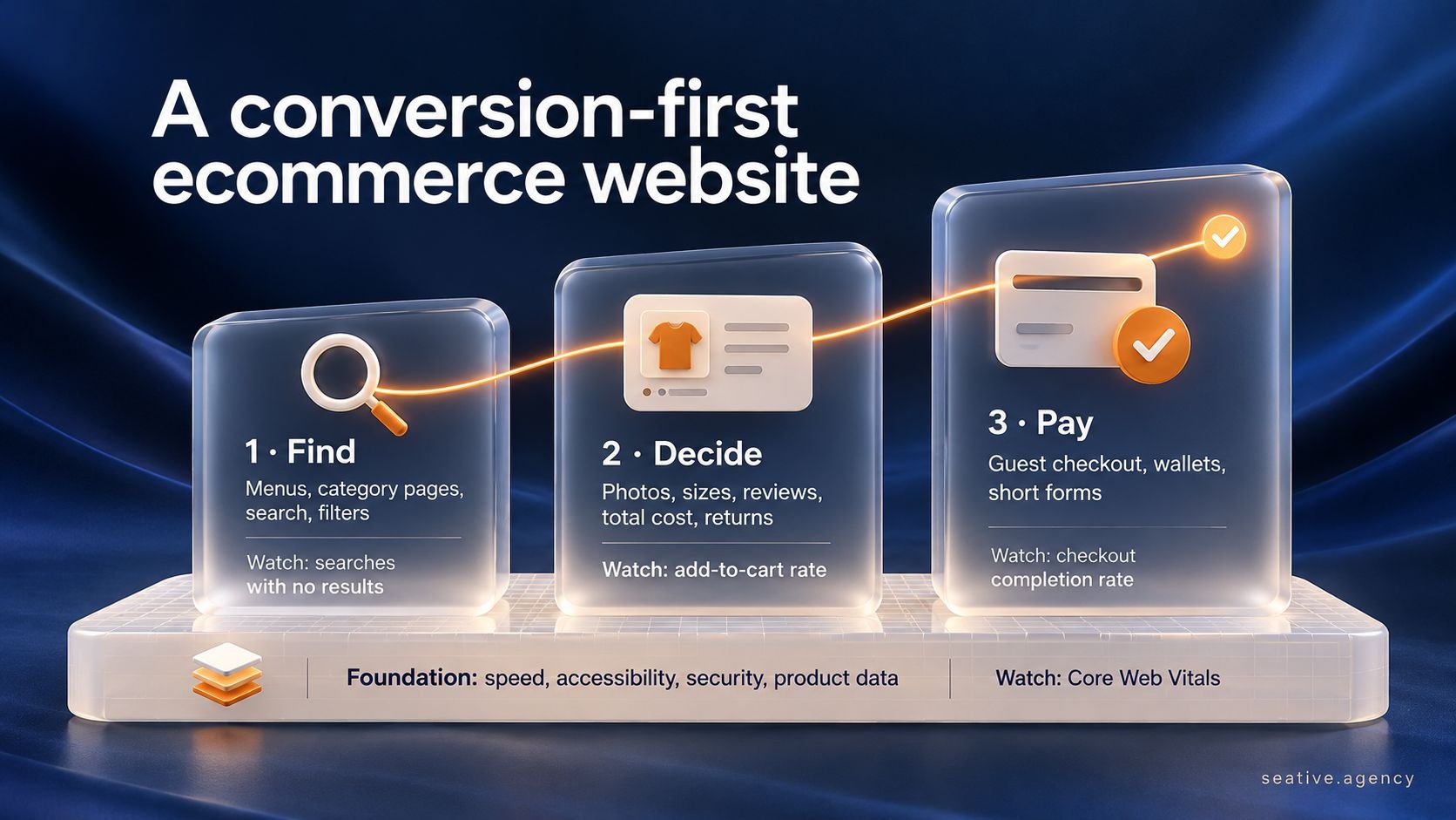
Shoppers find products by browsing menus and category pages, by searching, and by filtering results. So name categories the way your customers talk, keep the main menu short, and make search forgiving of typos, abbreviations and product codes.
That's the Find layer, and it rests on your information architecture, which means how products are grouped and labeled. Think about walking into a supermarket you've never visited. You scan the aisle signs, and if nothing says "breakfast," you ask someone stacking shelves.
Your menu is those signs and your search box is that helpful person, so both should speak your shoppers' language. The comparison stops at patience, though, since closing a tab is easier than leaving a shop.
That impatience is why search deserves extra care. Baymard Institute's search research found that 56% of sites don't adequately support what users search for. You've been that shopper too: you type a product name, see "No results" and go elsewhere.
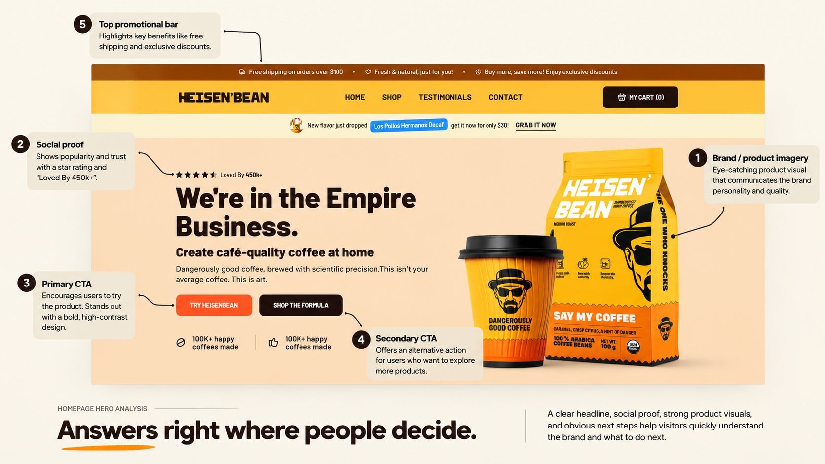
Every product page should answer what a shopper would ask in a shop: how it looks up close, whether it fits, what it costs with delivery, when it arrives and how returns work. Put the total cost, delivery date and returns line near the Add to cart button.
That's the Decide layer. Say you're buying a jacket in a shop: you turn it over, try it on and ask whether you can bring it back.
Online, photos do the turning over, while size guides and reviews do the trying on. Nobody's standing there for follow-up questions, though, so the page has to answer them first.
Stick with me for a second, because many stores skip those answers. Baymard's product page research found that 60% of users look for return policy details on the product page, yet 44% of sites don't show or link them there. And 67% of sites show no total cost estimate near the buy button.
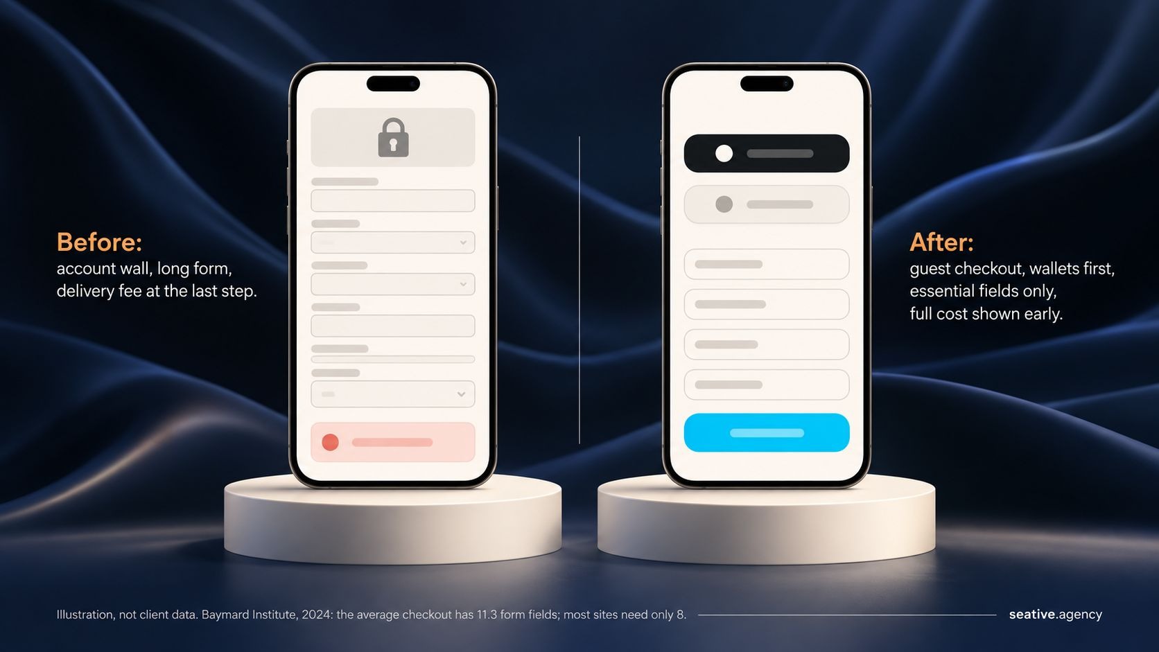
Design a checkout people finish by showing the full cost early, allowing guest checkout, putting wallets like Apple Pay, Google Pay and Shop Pay first, and asking only for the fields you need. Baymard Institute puts the average cart abandonment rate at 70.22%.
This is the Pay layer, and if your reports show plenty of add-to-carts but few sales, you're not alone, judging by the Shopify Community forums. Unexpected costs are a common culprit.
A simple example is a restaurant bill with a service charge nobody mentioned: the meal was fine, but the surprise is what you remember. Surprise delivery fees at checkout feel the same, except your shopper hasn't eaten yet, so they can walk away.
Here's how the top reasons in Baymard's survey map to design fixes:
Baymard's 2024 checkout benchmark also found the average checkout has 11.3 form fields, while most sites need only 8. And Baymard estimates that better checkout design could raise the average large store's conversion rate by 35.26%.
Your store should pass Google's Core Web Vitals: main content loads within 2.5 seconds, clicks get a response in under 200 milliseconds, and the layout shift score stays under 0.1. It should also work with a keyboard and a screen reader.
These numbers hold up all three layers, and I know speed sounds like your developer's job, but your shoppers feel it first. Imagine a shop door that sticks: some people push harder, but plenty walk on to the next shop, and a slow page is that door.
That door is usually on a phone: Adobe found that 56.4% of US online holiday purchases in 2025 happened on smartphones. So design mobile first, with the thumb-first rules from our mobile app design guide.
On those phones, product pages load fastest when the layout is built ahead of time and only price and stock stream in, as our guide to edge rendering and performance explains.
Accessibility sits in the same foundation. If you sell in the EU, the European Accessibility Act has covered e-commerce since June 2025, so ask a legal adviser what applies to your store.
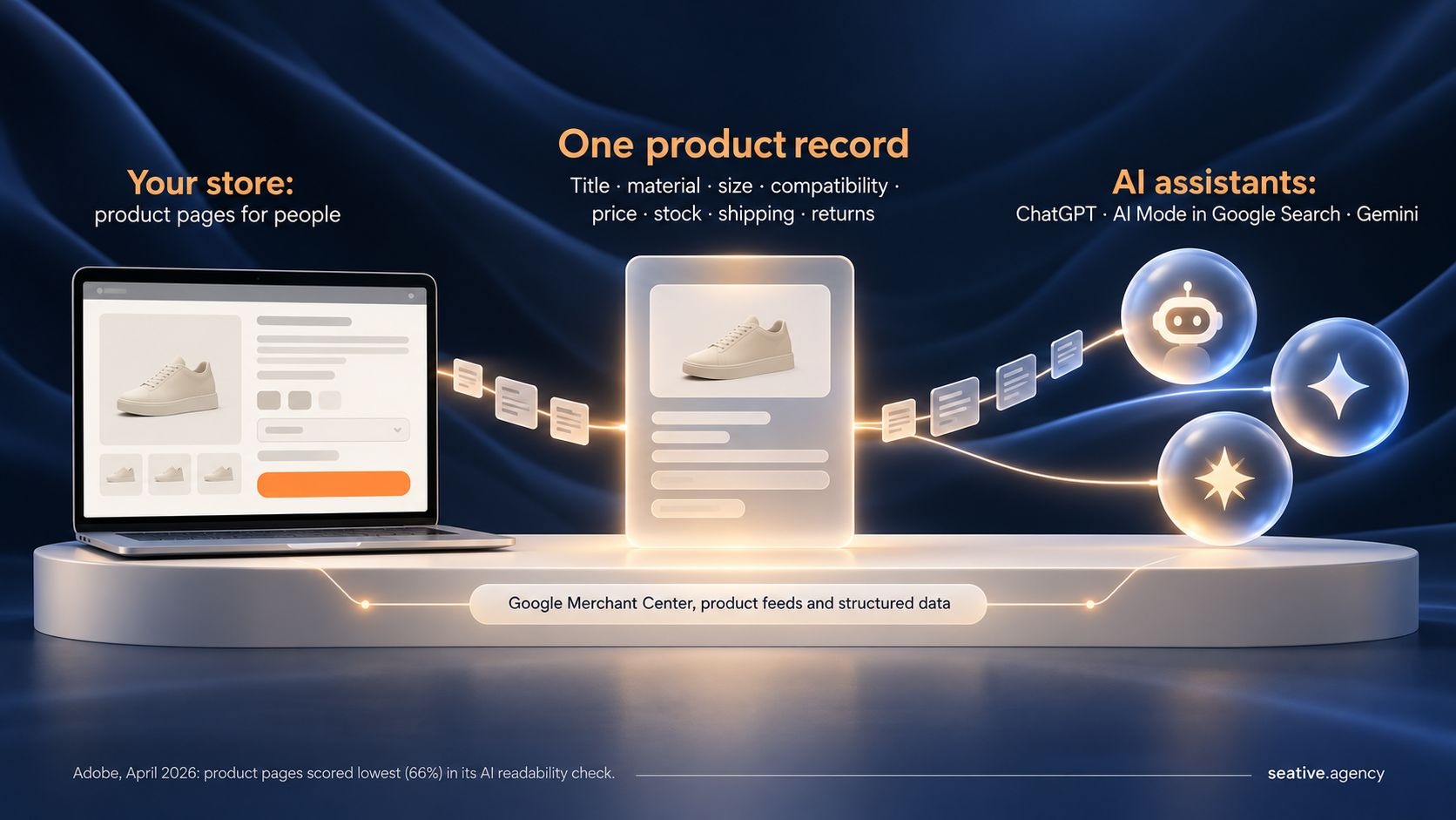
AI shopping assistants like ChatGPT, AI Mode in Google Search and Gemini now compare products for people, and some can complete the purchase. They rely on your product data, so complete titles, sizes, prices, stock and return policies now count as design work.
This is the newest part of your foundation. Adobe's AI shopping traffic research found AI traffic to US retail sites grew 393% year over year in early 2026, and in March it converted 42% better than other traffic. Yet product pages scored lowest in Adobe's AI readability check, at 66%.
Say you send a friend to the market with a list that says "rice, 5 kg, our usual brand." They'll pick the bag whose label matches best and skip any with a smudged label. An AI assistant is that friend, and your product data is the label.
Buying through these assistants is still changing. OpenAI moved ChatGPT purchases to merchants' own checkouts in March 2026. Google went the other way, adding checkout inside AI Mode and Gemini, as its I/O 2026 shopping update explains.
Fair question: does this matter for a small store? It does, because Shopify lists its merchants' products in ChatGPT by default, tidy or not. Here's where I'd start:
It depends mostly on how much is custom. Platform plans start at $29 a month billed yearly on Shopify Basic and Webflow's Standard ecommerce plan (October 2026). Design and build costs then grow with catalog size, custom features and integrations.
Yes, for a small catalog. Shopify and Webflow give you templates, hosting and payments, so you can launch without code. Bring in a designer when you need custom features, outgrow your template, or get plenty of visits but too few orders.
Choose Shopify for large catalogs, complex inventory or selling in many channels, including ChatGPT. Webflow suits smaller, content-led stores: its Standard ecommerce plan allows 500 items with a 2% transaction fee, and Plus allows 5,000 with no fee. If Webflow fits, our Webflow website service can build it.
Most stores need a home page, category and product pages, a cart, checkout and an order confirmation page. Add shipping, returns, contact and privacy pages, since shoppers often check them before paying, then search, accounts and an FAQ as you grow.
AI can draft layouts, product copy and images quickly, but it doesn't know your customers' doubts, your margins or your delivery promises. At Seative Digital, we use AI to speed up research, exploration and repetitive tasks, and experienced designers refine every output.
So if you're working out how to design an ecommerce website in 2026, start with the order your shoppers decide in, one layer at a time. Then buy something from your own store on your phone, as a guest, and note every moment you hesitate. Those notes are your redesign brief.
If you'd like a second opinion, book a 30-minute strategy call and we'll walk through your store's find, decide and pay layers together.